AppFit: Optimizing the User Journey for Peak Performance
AppFit is an analytics suite designed to identify friction points in the user experience. By visualizing drop-off rates and engagement patterns, the platform empowers product teams to "trim the fat" from their workflows and build a leaner, more conversion-oriented product.
Project Brief
Background
AppFit is an analytics dashboard for product development teams. When I jumped onto the project as a Product Designer, it was an existing product that needed a visual refresh as well as user experience improvements.
Company Name
AppFit
Job Type
Internal Product within Agency
Company Size
1-10
Company Type
Startup
Role
Product Designer
6 months total
Team Size
5
Collaborators
Product Manager, Engineers
Project Details
Development
Flutter, Android, iPhone, Webapp
Tools
Figma, Figjam, Jira, Miro
Goals
Get/keep users on the app by Q2, begin pricing by Q3.
Initiatives
To reach the goal, the task is divided into 3 initiatives:
Improve UI/UX of product to keep users in the app,
Refresh marketing website to match new changes to product
Update sign up flow to increase more users.
Design Process
My process is flexible but always user-first. I start with empathy and problem definition, move into ideation and prototyping, and vavlidate decisions through testing. This cycle allows me to adapt quickly while keeping the user experience at the center.
empathize
ideate
prototype
test
define
empathize
Key UX Methods
I started by listening to users through interviews and analyzing the market landscape through a competitive analysis. Then, I translated findings into wireframes, which evolved through usability testing until the final designs felt intuitive, accessible, and impactful.
user interview
wireframes
competitive analysis
usability test
Problem Discovery
Initial Interviews
I conducted five interviews with product managers between the ages of 35–50, ranging from entry-level (1–5 years experience) to advanced-level (10+ years). The goal was to understand their day-to-day workflows so I could design features that directly support their needs. Since the app is intended to simplify and centralize a product manager’s responsibilities, these insights guided which features—like metric tracking and streamlined reporting—would be most impactful.
Key Needs: Scalable visibility across teams, customizable dashboards, early warning signals.
1-5 Years Experience
Entry-Level PM
“I spend a lot of time pulling metrics into spreadsheets just to make sense of performance.”
1-5 Years Experience
Entry-Level PM
“Half my day is chasing down updates from engineers so I can report status in meetings.”
1-5 Years Experience
Entry-Level PM
“It feels like I’m re-creating the same charts over and over instead of analyzing them.”
5-10 Years Experience
Experienced PMs
“I oversee multiple teams, so I need a high-level dashboard I can trust at a glance.”
5-10 Years Experience
Experienced PMs
“Most of my focus is on prioritization and aligning stakeholders, not digging into raw data.”
5-10 Years Experience
Experienced PMs
“If I can’t see where a project is slipping early, it creates a fire drill later.”
Interview Insights
I packaged similar feelings amongst all interviews to conclude 3 different ideas detailed below.
CONCLUSION #1
Product managers rely on metrics in their apps
I asked product managers about their daily workflows and how they monitor progress. Metrics were consistently mentioned as a critical tool for decision-making.
CONCLUSION #2
They prefer fast, simple processes
Most participants shared that they value efficiency, expecting “one-click” style sign-up or onboarding. This reinforced the need to keep the process as short and intuitive as possible, even when collecting important information.
CONCLUSION #3
They see onboarding as a critical first impression
PMs highlighted that the onboarding flow often sets the tone for how users perceive the product. A confusing or lengthy setup risks losing users before they ever experience the value of the platform.
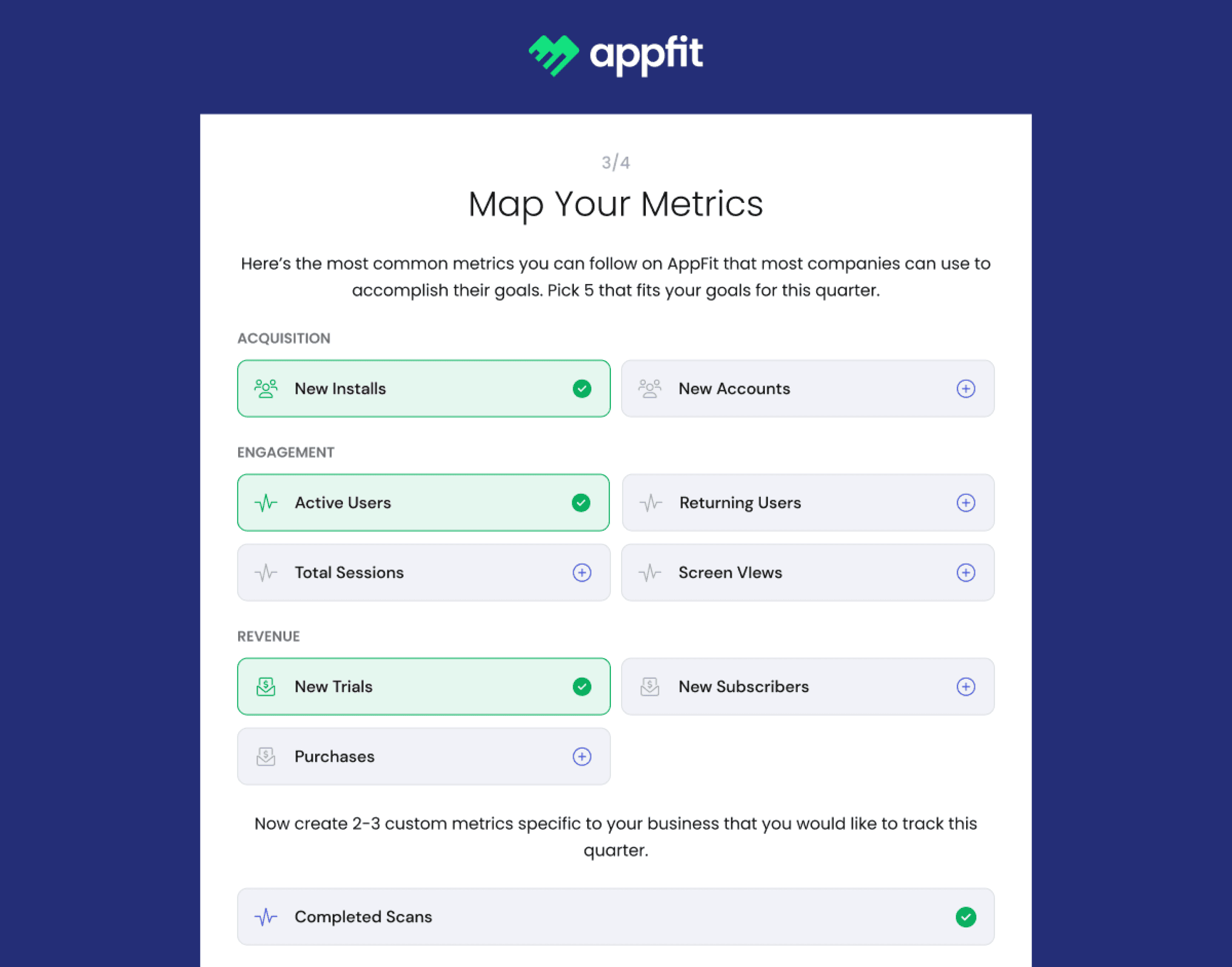
Wireframes
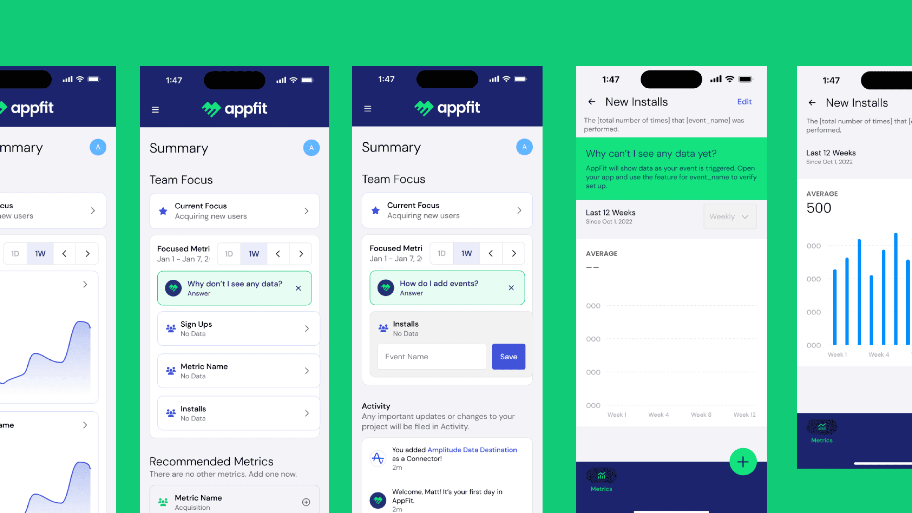
Summary Page
The dashboard is structured using a top-to-bottom information hierarchy, prioritizing high-value insights (focused metrics) before secondary data such as additional metrics and activity logs.
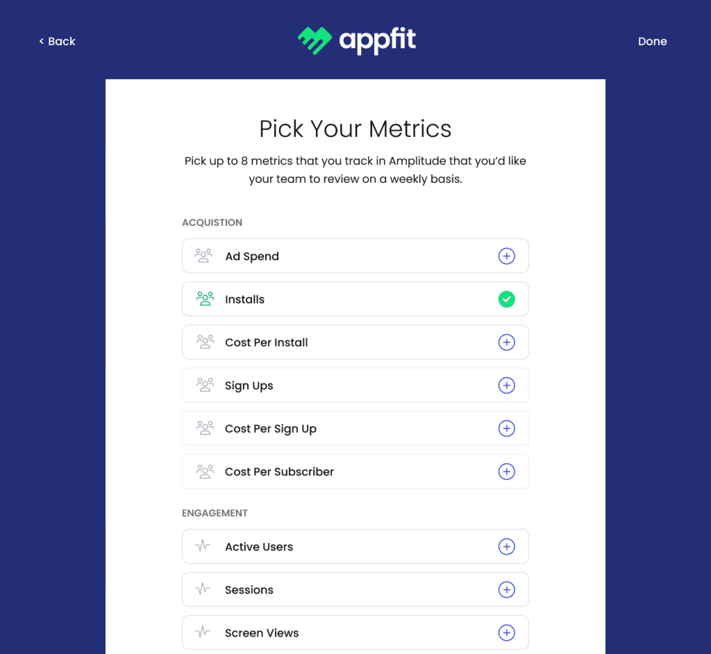
A “Focused Metrics” section allows users to define the KPIs most relevant to their goals, reducing cognitive overload and ensuring critical analytics are immediately visible.
The “Other Metrics” section surfaces additional data points that are not part of the primary focus, allowing users to explore insights without cluttering the main dashboard.
Recommended data connectors guide users toward missing integrations, helping teams enrich their analytics dataset and discover insights they may otherwise overlook.
Activity and collaboration features, such as the activity feed and team invitations, reinforce that analytics is a shared team workflow rather than a single-user tool.

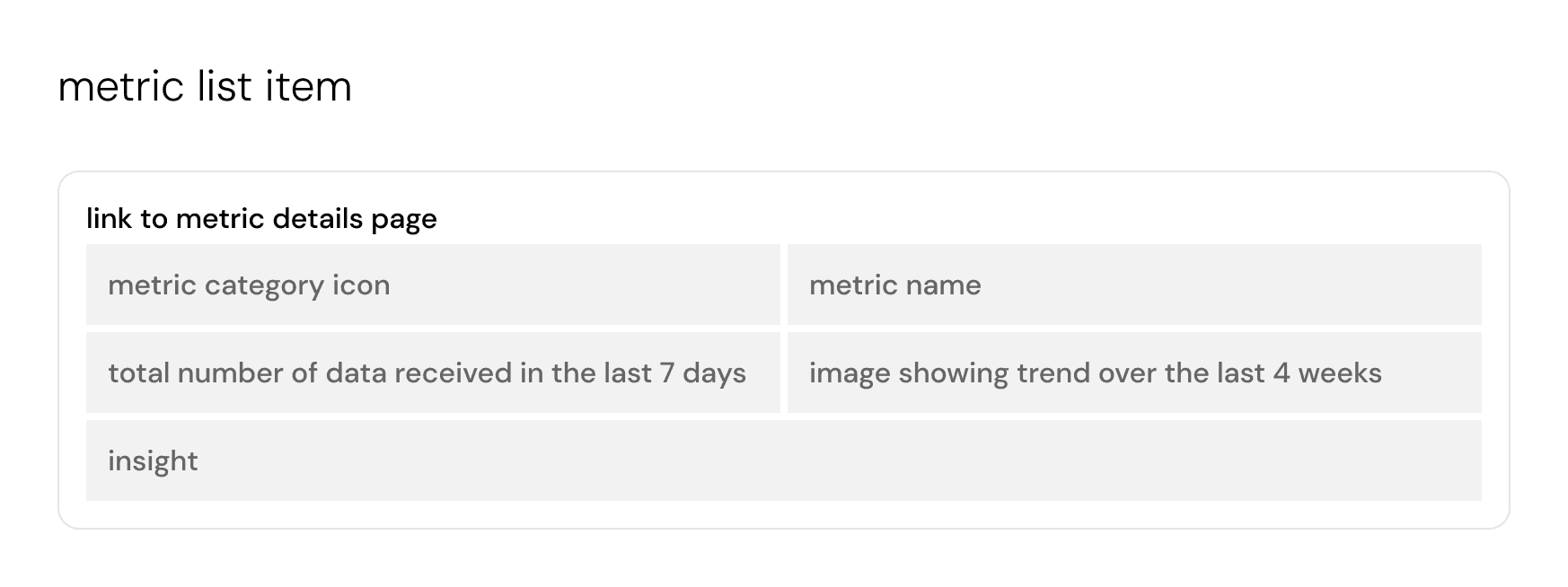
Metric Details & Metric List Item
The page prioritizes high-level metric information and weekly performance summaries so users can quickly understand the current state of a metric before exploring deeper analysis.
Trend visualizations and breakdown sections help users interpret performance over time and identify patterns or contributing segments within the data.
Connected data and recommended data sections provide transparency into how the metric is generated while guiding users toward additional integrations that could improve data accuracy.
The design supports collaborative analytics through role-based permissions, allowing viewers to access information while enabling editors to update metric configurations and comments.
Comments and activity tracking allow teams to document insights, explain anomalies, and maintain shared context around changes or observations related to the metric.

Competitive Analysis
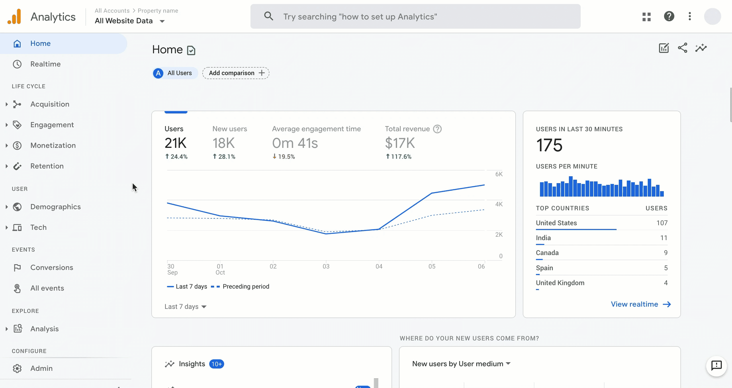
The competitive analysis showed that tools like Amplitude and Mixpanel provide powerful behavioral analytics but often introduce complexity for non-technical users. Meanwhile, Google Analytics for Firebase focuses more on mobile and marketing analytics rather than product insights. This revealed an opportunity to design an analytics tool that prioritizes clear dashboards and faster insight discovery without requiring advanced analytics expertise.
Amplitude
Focuses heavily on behavioral product analytics, allowing teams to analyze complex user journeys across multiple touchpoints.
Strong cohort analysis and behavioral segmentation, helping product teams identify patterns in retention and engagement.
Offers advanced experimentation tools, including built-in A/B testing and predictive cohorts.
Designed for enterprise-scale data governance, with strong data management and export capabilities.
Interface is powerful but often has a steeper learning curve for non-technical teams compared to competitors.

Mixpanel
Uses event-based analytics, tracking specific user actions (clicks, sign-ups, interactions) rather than simple page views.
Provides strong funnel analysis to identify drop-off points and optimize conversion flows.
Supports user segmentation and cohort analysis to track behavioral patterns across user groups.
Offers highly customizable dashboards and reporting, making it easier for teams to visualize data.
Known for being more intuitive and accessible for non-technical users compared with some analytics platforms.

Google Analytics
Built primarily for mobile and app analytics, tightly integrated with the Firebase development ecosystem.
Automatically collects app engagement metrics and event tracking without extensive configuration.
Provides real-time analytics and user behavior tracking across Android, iOS, and web apps.
Integrates directly with Google services such as BigQuery, Ads, and Crashlytics for a unified data pipeline.
Focuses more on marketing and acquisition analytics, while tools like Amplitude and Mixpanel emphasize product analytics.
ideate
Dashboard
Before
Issues with Structure: The “Weekly Summary” page was static and text-heavy. Users had to manually add data for each metric, which slowed down onboarding and made the interface feel overwhelming.
Cluttered Metrics Section: Each metric required separate setup with little guidance, forcing users to figure out connections on their own.
Low Guidance: The only instructions appeared in a dismissible banner, meaning once closed, there was no clear setup pathway.

After
Introduced Guided Setup: Added a clear step-by-step checklist in the sidebar (Connect Data → Map Events → Invite Team → Finalize), reducing confusion and giving users a sense of progress.
Simplified Metrics Presentation: Instead of an empty table of metrics waiting for manual input, the system now prompts users with placeholder fields and goals, making it clear where to start.
Improved Navigation: Shifted to a left-hand navigation bar with dedicated categories (Summary, Connectors, Metrics, Goals, Settings) so users can easily find their way without relying on a single cluttered screen.
Personalization: Greeted the user (“Welcome, Matt!”) and highlighted “Your Focus This Week” so the dashboard feels tailored and purposeful rather than generic.

Onboarding
Before
Issues with Structure: The “Weekly Summary” page was static and text-heavy. Users had to manually add data for each metric, which slowed down onboarding and made the interface feel overwhelming.
Cluttered Metrics Section: Each metric required separate setup with little guidance, forcing users to figure out connections on their own.
Low Guidance: The only instructions appeared in a dismissible banner, meaning once closed, there was no clear setup pathway.
After
Introduced Guided Setup: Added a clear step-by-step checklist in the sidebar (Connect Data → Map Events → Invite Team → Finalize), reducing confusion and giving users a sense of progress.
Simplified Metrics Presentation: Instead of an empty table of metrics waiting for manual input, the system now prompts users with placeholder fields and goals, making it clear where to start.
Improved Navigation: Shifted to a left-hand navigation bar with dedicated categories (Summary, Connectors, Metrics, Goals, Settings) so users can easily find their way without relying on a single cluttered screen.
Personalization: Greeted the user (“Welcome, Matt!”) and highlighted “Your Focus This Week” so the dashboard feels tailored and purposeful rather than generic.
prototype
New Design Standards
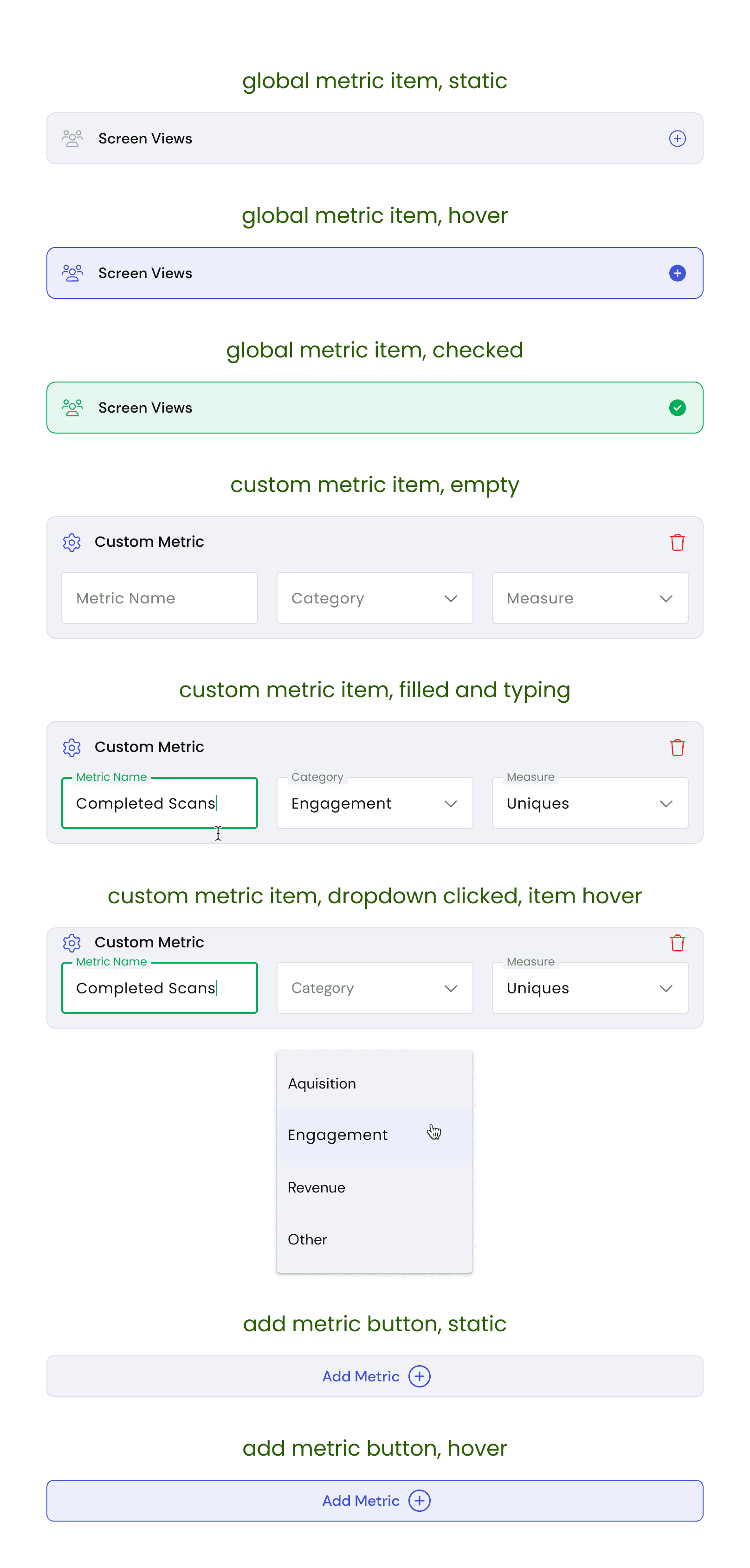
I documented interactions of existing and new components with acceptance criteria so developers know the intended design for each state. We used Google Material 3 as the base.
test
User Feedback
I conducted five interviews with product managers between the ages of 35–50, ranging from entry-level (1–5 years experience) to advanced-level (10+ years). The goal was to track their experience while using the onboarding flow in Appfit.
Overall, users appreciated the simple onboarding UI
Test participants responded positively to the streamlined interface, noting that it made getting started feel less intimidating.
3/5 Users questioned metric definitions
Some users understood the concept of metrics but hesitated during setup. They lacked confidence in applying definitions until progressing further in the onboarding sequence.
2/5 Users felt the onboarding could use less steps.
Some users suggested trimming the initial setup into a shorter flow, such as a single proof-of-concept, to enter the app faster and explore functionality sooner.
define
Conclusion
Redesigning the AppFit dashboard highlighted the importance of balancing clarity with flexibility. Early interviews and usability tests made it clear that both entry-level and senior product managers needed different levels of visibility—some required fast, simple workflows, while others valued advanced tracking and oversight. By focusing on guided onboarding, improved information hierarchy, and accessible design standards, I was able to create a dashboard that reduced friction for first-time users while scaling to advanced needs.
One of the biggest lessons I learned was that onboarding is never just about setup—it’s about trust. By replacing static instructions with step-by-step guidance, I helped users feel confident and supported from their very first interaction.
Going forward, I see opportunities to continue iterating by:
Expanding personalization (customizable dashboards by role/priority)
Exploring integrations with more third-party tools
Running additional A/B tests on website messaging to further optimize conversions
This project reinforced my belief that small usability improvements—like reducing steps, clarifying instructions, and improving legibility—can create an outsized impact on adoption and retention. It also reminded me that successful design comes from listening first, then building solutions that respect users’ time and context.